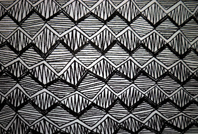
These drawings were just initial ideas of the kind of 'patterns' I had in mind.
(Ladytron - Runaway. Set by Music for Patterns)
The graphic style of the 'Runaway' video works so well for the electro sound, which is very clean and sharp. Despite the lines growing out in different directions and being of varying widths, they are so precise, which I really like. I also like the way the lines cover the clothing, to camouflage the band.
The set was created by Music for Patterns, and was initially an installation piece: Centre for the Aesthetic Revolution - Music for Patterns and Way Things Are
After researching more into the band and their artwork, it seems that graphic patterns are quite a major part of their appearance.
(Ladytron - Playgirl)
(Ladytron - Blue Jeans)
Though very different to 'Runaway', these two videos still use graphic black and white images, which are far more bold than colour. I particularly like the overlapping images in 'Blue Jeans', using different transparencies. This method could be interesting to experiment with for images of The Pois.
(Poster by El Jefe Design)
The continuity within Ladytron's artwork is something I admire as they're instantly recognisable as that band. They're hugely eye catching, and that's what I'd ideally like to achieve with my Pois merchandise.
I have decided that El Jefe Design create the greatest posters.


No comments:
Post a Comment