Tuesday, 15 March 2011
The Petits Pois
Continuing with the circles (and actually forming circles rather than stars like last time..) I wanted to create the band name without using solid outlines. I like the outcome, though people think I'm mental for spending the time drawing each circle. I enjoy the repetition. I'd like to see how these images look inversely - white ink on black paper.
This design could work well for a t-shirt, as it's bold and would catch the eye from a distance, which is always necessary if a t-shirt is on display at a gig.
After writing the history of The Petits Pois, including a discography, I am designing sleeves for all the releases, in order to have a back catalogue for the fake band to feel more real. This idea incorporates my love for Art Nouveau and Psychedelic writing styles - forming the letters to fit a shape. It isn't finished, but I think it looks too sparse. I'd like to see what it would look like with a patterned background, to make it really over the top. It might be too much and end up blinding me, or it could be too much in an op-art way. It does desperately need something in the background though, perhaps just plain black if pattern is too much.
Embroidery
These are two rather bad attempts at embroidery. They had mixed reviews, but Frank quite liked them. I wanted to experiment with embroidery after the exhibition for the Chinese robes, and as I am going to make merchandise for The Petits Pois, I also wanted to incorporate some kind of symbolism. I have decided to focus on circles as the main pattern for my images now. Clearly the circular idea failed for these embroideries, as they are obviously STARS, but I will retry this and just sew more lines in order to create more of a circle.
I used black thread for one and white for the other, as a few robes had used thread and fabric of the same colour. However, most had used different colours. I had a few comments from puzzled people as to quite why I was using black thread on black paper, but personally I prefer the outcome of this to the white on black. It is more subtle, whereas the white thread somehow looks childish and messy.
Research: Psychedelic Art
('Theseus and the Minotaur', Charles Giuliano. Ink on paper, 1966)
('Landscape', Ayne Palmer. Ink and coloured dyes on paper, 1965)
I borrowed 'Psychedelic Art' - Robert E L Masters & Jean Houston to help with my research for the FMP brief, and these two pieces caught my eye. They remind me so much of the virus structures I posted earlier. I think the way the shapes within the design fit together is fascinating, and you constantly have something to look at, before your eyes start burning.. They also use very simple materials - ink and paper, yet they create such mezmerising images.
Research: Ladytron
My tutor recommended I look at Ladytron's 'Runaway' video, after a couple of drawings I'd done.
These drawings were just initial ideas of the kind of 'patterns' I had in mind.
(Ladytron - Runaway. Set by Music for Patterns)
The graphic style of the 'Runaway' video works so well for the electro sound, which is very clean and sharp. Despite the lines growing out in different directions and being of varying widths, they are so precise, which I really like. I also like the way the lines cover the clothing, to camouflage the band.
The set was created by Music for Patterns, and was initially an installation piece: Centre for the Aesthetic Revolution - Music for Patterns and Way Things Are
After researching more into the band and their artwork, it seems that graphic patterns are quite a major part of their appearance.
(Ladytron - Playgirl)
(Ladytron - Blue Jeans)
Though very different to 'Runaway', these two videos still use graphic black and white images, which are far more bold than colour. I particularly like the overlapping images in 'Blue Jeans', using different transparencies. This method could be interesting to experiment with for images of The Pois.
(Poster by El Jefe Design)
The continuity within Ladytron's artwork is something I admire as they're instantly recognisable as that band. They're hugely eye catching, and that's what I'd ideally like to achieve with my Pois merchandise.
I have decided that El Jefe Design create the greatest posters.
Monday, 7 March 2011
Research: V&A
The V&A is definitely my favourite museum, as it's full of design pieces of various sorts. I knew it would be an excellent place to go to look for 'pattern'. The current main exhibition there is 'Imperial Chinese Robes - from the Forbidden City'. Traditional Chinese textiles are always really interesting because there's so much to look at on the fabric, in comparison to say traditional British textiles, that are generally far more simple.
I had an hour to kill before I could go into the exhibition, so I looked around the Medieval and Renaissance galleries.
(Reliquary Casket, 1185-95)
I find most religious art, particularly from this period, very beautiful. The work that goes into the pieces is amazing. The section from the Reliquary Casket is from the back, yet it is as detailed and interesting as the front.
(Details from The Arnstein Bible, 1172, text illumination by the Monk Lunandus)
I realised that the same colours were used in most of the Medieval pieces. A lot of reds, golds and blues. Everything is very repetitive, and therefore very recognisable. The text illuminations were my favourite exhibit from the collection as there is more attention focused on the lines, rather than the representation of people. It is hard to follow a line in the image, as there are always others curling around and going off in different directions.
(The Clare Chasuble, 1272-94)
The exhibition was packed, but after shoving a few old ladies out of the way I managed to get a good look at the work on show. Please note that there was no shoving involved, I am far too respectful (and modest..). An old northern gent even wished me luck on my future career!
(Top & bottom: Emperor's dragon robe, 1736-95)
These details were from my favourite item within the collection. I was really struck by the simplicity colourwise. Most of the pieces, though amazing, were just so loud, cramming as many primary colours into the design as much as possible. There was something about the combination of only brown and gold that made this robe stand out more than the others.
I concentrated on the wave design at the bottom of the robe, as I liked the combination of lines. Waves symbolise the difference between the human world and the 'Three Isles of the Immortals'.
(Empress's winter court skirt, 1662-1722)
(Details from: Empress's informal robe, 1875-1908 and Man's informals sleeveless waistcoat, 1862-1908)
The circular character was repeated in various forms on most of the garments. It represents longevity. I just liked how recognisable it was. They're made up of such simple shapes, yet they're quite confusing.
The crane is also a symbol of longevity, and it is believed that they carry the spirits to the heavens. I wanted to concentrate on the detail of the crane - every feather is drawn, rather than a whole wing shape. The attention to detail fascinates me.
I'd like to experiment with embroidery on various materials. I really like the way everything in Chinese art is symbolic, but not in a pretentious symbolic way.
To relate it to The Petits Pois (fake band) I need to design some symbols. They'll probably need to relate to peas.. which could prove difficult. I would also quite like to not have to use green all the time. I think circular motifs could work well without being green.
Sunday, 6 March 2011
Research: Things under the microscope
The 'Society for General Microbiology 2011 Calendar' was given to me for the New Year (actually I rescued it from being thrown away, as I appreciated the rather grim and unusual photographs), and I was particularly drawn to a close-up image of the HPV virus.
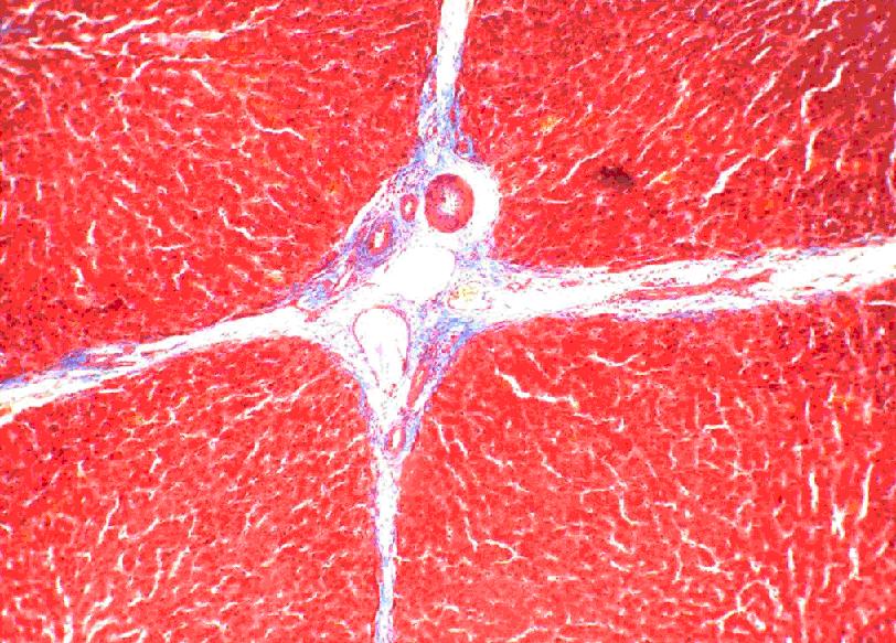
This image led me to research structures of other things under the microscope. A friend recommended looking at slices of liver.
(Images taken from Google)
The slices of liver under the microscope were beautiful and hugely colourful. As striking as the colours are, personally I would prefer to work in black and white, or with very limited colour. Images are bolder, and it is generally easier to notice detail, if colours are not so distracting. I changed the first image of liver to greyscale as it made much more impact.
Unfortunately I can't remember where I found the above image, so I can't find out what it's a close-up of, but I chose it for the way the cells are presented. It resembles a pencil drawing more than a photograph. The muted colours make it easy on the eye, yet still really interesting. It is not loud and intrusive, as the image above it is.
(Image: Taken by Yersinia, from 'Microscope' pool on Flickr)
This final image is of a stomatal imprint of the topside of a spinach leaf. It reminded me of a pattern I draw a lot:
(Image: my own)
This consists of only one line. I've been filling pages with pattern for years, but haven't considered how similar it looks to cell structures. I'm aiming to use this kind of intricacy and detail within the work I produce for this project.
(Image: Society for General Microbiology 2011 Calendar, Jan. Taken by Kwangshin Kim)
For something so horrible it makes a brilliant pattern, and I liked the simplicity of the colours as it makes the image far more bold.
This image led me to research structures of other things under the microscope. A friend recommended looking at slices of liver.
Unfortunately I can't remember where I found the above image, so I can't find out what it's a close-up of, but I chose it for the way the cells are presented. It resembles a pencil drawing more than a photograph. The muted colours make it easy on the eye, yet still really interesting. It is not loud and intrusive, as the image above it is.
Subscribe to:
Posts (Atom)